Case Study: Reverb Empty States
Nothing To See Here…Except An Opportunity to Delight!
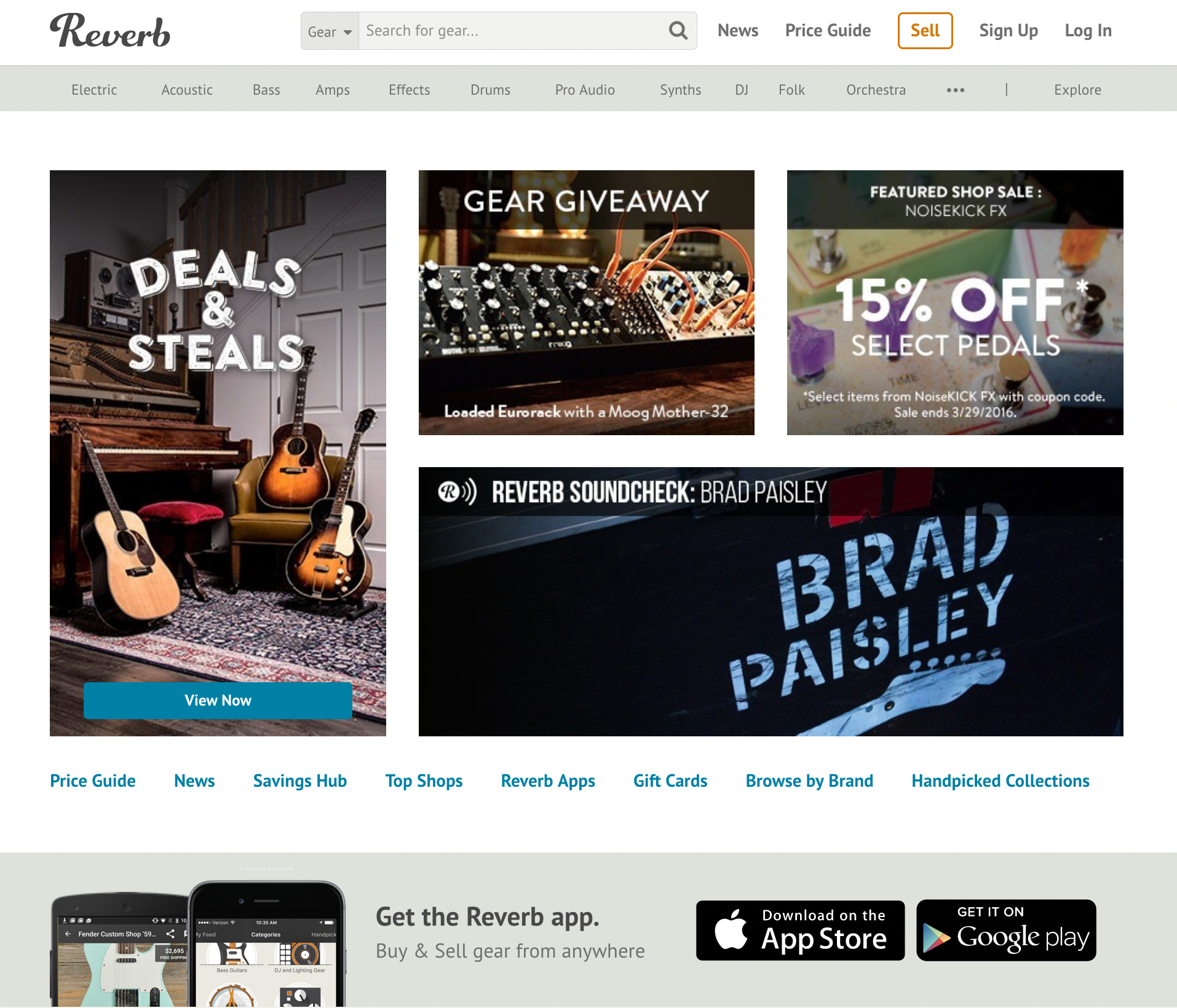
In 2016, I was the Director of Marketing at Reverb.com. Reverb is an online marketplace for new, used, and vintage music gear (think “eBay for guitars”). Reverb was a venture-backed startup that had launched in early 2013 and by year 3 we were putting more polish on the product, particularly the mobile app.
I had been working closely with my marketing design team to hone the brand photography, website graphics, and overall look-and-feel to create a recognizable “Reverb vibe” and to establish design standards that would help us scale our marketing across all channels (video, social, email, print, web, etc).
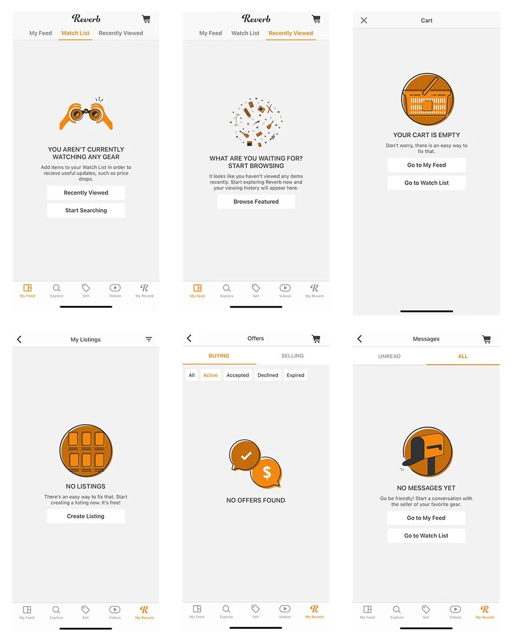
That’s when the mobile development team came to me with a project. Our mobile app had nearly 60 empty state screens that could use a little love. I got together with our head graphic designer who also happened to be a phenomenal illustrator and we started to hatch a plan.
ABOUT EMPTY STATES
In a mobile application, empty states are screens or features that have not yet been configured by the user. Once the user starts to interact with a product, content will populate – but initially, they’re empty.
For example, concepts like “recently viewed”, “favorites”, “unread messages”, and “notifications” all require an empty state design.
THE OPPORTUNITY
Empty state screens can be completely utilitarian or they can be fun, even whimsical. Either way, they provide an opportunity to do a number of things:
Communicate the status of a feature
Help users learn the system (e.g., “you have no messages, but this is where they will be located once you do have messages”)
Help users discover unused features
Provide direct pathways to using the feature; an ideal “next action”
Entertain and delight!
The last point here is my favorite. The opportunity to delight is where we can really stand out from other applications. When you have 60 empty screens and a user’s undivided attention – why not have some fun with it!?
THE PROJECT
So, we made a list of all of the empty state screens and spoke to the dev team to make sure we fully understood the context for each. Then, I wrote copy for every single screen – trying to keep messaging simple and clear (to aid usability).
Next, I brought my copy drafts to the illustrator and we brainstormed possible graphic ideas together. Some were pretty simple and others were really fun! All were original and gave our empty state screens that little “something extra” for users to enjoy.
THE RESULT
Here are just a few examples of the Reverb empty state screens and custom illustrations:
WHY IT MATTERS
Why did I believe it was important to put this extra effort into the Reverb empty states project? When I’m using a product or service I always notice these little things. Sure, the “offers” screen could just as easily say “You have no offers” and it would be fine. It would be functional.
However, when I (as a user) see something that’s clever, cute, or creative and it’s clearly not necessary, that’s actually when it strikes me the most. That’s when I think — Wow, they didn’t need to do this, but the folks who work at this company took a little extra time to give this obscure feature some personality. There are real people behind this who are thoughtful and value joy. People who care about me and my experience.
These are the interactions that endear users to a product or service.